By Andy Joel
If you are scratch-building or kit building, water-slide transfers are a great way to add numbers, logos, warnings and other indicia to your model. A lot of these can be purchased from companies like Fox and Railtec (see appendix 1), but inevitably there are things they do not have, and you might want to look at printing yourself.
The “White” Problem
You need to be aware of the limitation of printing your own transfer, and that is white.
A standard printer works by depositing ink on paper (you probably knew that!). The more ink, the darker the colour. The less ink, the lighter. If there is no ink, you see white.
That is great on paper, but what happens if you print on a transparent sheet? Instead of white, you get transparent. And if your transfer is going over something that is already black, that space will look black, not white.
The professional companies have access to fancy printers that also have white ink as well as the normal colours, but these printers are thousands of pounds, so well out of my price range.
We have three options:
Print on to transparent sheets, but only use the transfer on white (or very pale) areas. An option here might be to paint a white panel on your wagon, and put the transfer over that, but that may require very careful painting – exactly what we are trying to avoid by using transfers.
Print on to white sheets, and cut out the transfer to the exact shape and size so there is no border. With my cutting skills this limits me to squares, rectangles and triangles! You also need the image to be big enough that you can handle it.
Print on to white, and give your images a border that exactly matches the paint colour in the area. May not sound difficult, but getting a match close enough to be unnoticeable is very tricky. I have tried it, and decided it was not good enough, but you may have more luck (I am colour blind, which does not help!). It would be easier if the background is black, but even then it be more, or less, glossy than the surface. Of course, weathering can hide a multitude of sins. Bear in mind that it may look different on white paper, so it could take a few trials on water-slide transfer paper, which is not that cheap – or better, try several similar colours on one sheet, and see which matches.
Clearly which of these will work for you depends on your situation, and you should appreciate that some things are just not going to be suitable at all. British Rail’s arrows of indecision, for example, is something I would not attempt – but of course is readily available to buy.
Is there no way to print white?
I have seen some claims that you can print white somehow with a normal printer. I have not investigated them, so cannot comment, but this may be worth looking at.
Software
So how are you going to create the design to be printed? I recommend two different programs, useful in different ways. Both are free (see Appendix 6 for more on free software).
You can copy something from one program and paste it into the other as required.
GIMP
This is a great free alternative to PhotoShop, and does very much the same thing. In GIMP the image is stored on a pixel basis – this is, the colour at each point on the image is saved. This is the method used for photos, and indeed most images on the internet (though there are different formats within that, such as JPG/JPEG, PNG, GIF). It is great for editing photos and for artistic effects. GIMP is pretty good for text too, storing it in an editable form.
Download from here. Go to Download. It should recognise your operating system, and offer you two download choices; go for the “directly” one.
I am using version 2.10.18 on Windows; if you use a different version, there may be slight differences.
Inkscape
InkScape is a vector-based package. That means the image is saved as a set of instructions telling the computer how the image is to be draw – place a blue circle here, a red square there, etc. InkScape is excellent when you want to create something made up from specific shapes and letters (like many logos) from scratch.
Download from here. Go to Download – Current Version, then select your operating system. For Windows you have a few extra choices: select 32-bit or 64-bit (unless your computer is old, it will be 64-bit), then select the Windows installer.
I am using version 1.0 on Windows; again, if you use a different version, there may be slight differences.
General Notes
The transfer sheets are not cheap and can only be used once through your printer, so you are best putting as much on a sheet as you can.
That said, most printers will print on A6, which is a quarter A4. It is a good idea to cut your A4 sheets into quarters, and print as A6. You will need to set your software to be A6 size, and when you print, go into the printer properties and check the paper size there too.
I would recommend printing out on paper first to make sure it is okay (no typos, right size), before printing on the sheets. Be aware that the sheets can only be printed on one side, so be careful which way you put them in your printer.
Getting started
We will use InkScape as the basis for our sheet. Fire it up and you should see a blank page – a rectangle in black outline. Go to File – Document properties, and check “A6” is selected (I would also check the units are set to mm). That rectangle is your page, and everything needs to go inside there.
When creating a sheet, decide in advance whether it is to be printed on white or transparent, as that will determine which images will go on it. I would suggest giving the file a name that makes this clear.
A Simple Logo
The easiest way to do a logo is to find it on the Internet, with a Google Images search. As an example, we will create a BP logo, ca, 1980, so search for “bp logo”. Clicking on a suitable image will have it appear larger on the right, as seen here:
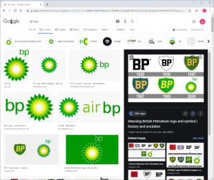
Convenient that the image itself tells me the right logo for the era!
Right click on the larger image on the right, and select “Copy image”. This will save the image to the clipboard.
I said we would do this in InkScape, but we will use GIMP first to modify the image, before adding to InkScape. Start up GIMP, and go to File – Create… – From clipboard. The logo should appear.
Let us take a moment to look at the GIMP toolbar; it is in the top left corner, as you see here:
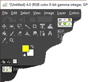
Some of these we will use a lot, so it is worth getting to know them. Top left of these is the “Move” tool; it looks like a cross with an arrow on each branch. The next three are all selection tools. We will start with the box with a dotted line; the Rectangle Select Tool. When it is selected, drag the mouse over your image to select a box. Try it now; draw a box around the logo you want. If you get it wrong, just try again. You can also drag just inside the edge or corner of a selection box to adjust it. Once you have a selection box around your logo with a very small border, select Image – Crop to selection to remove all the extraneous logos.
The third is the Free Select Tool. It works kind of like the Rectangle Select Tool, except you can draw any shape you want with it.
The fourth is the Fuzzy Select Tool, and looks like a magic wand. It selects areas of the same colour. Click on the white area around the logo, and all the white will be selected.
Let us jump to the tenth now. This is the Eraser Tool, and looks somewhat like a rubber. Making sure you still have the white areas selected, drag your mouse over the image. You should fine the white is replaced by a grey checked patterned which represents transparent (if it does not, go to Layer – Transparency – Add alpha channel, and try again). Remove all the white from the image. You can adjust the size of the tool using the slider at the top right.
Save the image (File – Save).
Go Select – None, then Edit – Copy to copy the image to clipboard (if you do not do Select – None, you will only copy the selected part, which is just the transparent parts of the image). Now go to InkScape, there do Edit – Paste.
Now we are in InkScape we need to size the logo. When the logo is selected, you will see eight double-headed arrows around it. Dragging these will change the size. If you hold down the Crtl key whilst dragging the corners, it will keep the ratio of the width to the height the same. The width and height are reported along the toolbar at the top (but note this is the size of the image, including any border you left on it).
Once it is the right size, you can drag the logo itself to position it. Do Ctrl-D to duplicate it, and you can have as many as you want on the page.
Save the image (File – Save).
A Weathered Logo
Rolling stock looks so much better weathered, and it would be great if the logo was faded. This is easier to do on the transfer than the model (assuming you are printing into transparent sheet, not white).
Go back to the logo in GIMP, and select the Eraser Tool again. Top right you should see various options for the eraser. select a brush, and drag it down the logo; see how it looks. I think Oils looks pretty good, Splats, not so much.
If you do not like it, do Ctrl-Z to undo, and try another.
When you have it looking good, copy-and-paste into InkScape as before. Then undo all your changes in GIMP to take you back to the clean logo, and start again to get a different weathering pattern.
![]()
Note that you can change the opacity of an image in InkScape (i.e., how transparent it is); this is a simple way to have a logo a little faded.
If you are building a rake of wagons, little variations in the weathering can make each wagon individual. Even the placement of indicia varied significantly between wagons.
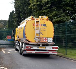
A Hazchem plate
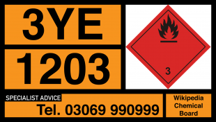
Hazchem plates are used on wagons (and lorries) transporting dangerous chemicals so in the event of an accident the emergency services can determine how to handle it as fast as possible. They typically look like this (discussed more in appendix 2):
Note that this is for printing on a white sheet (hopefully being a rectangle it can be easily cut out); the logo was for a transparent sheet.
To build an image from scratch it is usually easier to use InkScape – especially for boxes and text like this. However, the hazard diamond we can get from Google Images, copy into GIMP, and edit just as we did with the logo.
ADR regulations require the two top left boxes to be 400 mm by 300 mm, with the text 100 mm high, and the border and characters 15 mm thick. The hazard diamond is 250 mm along the side (so 354 mm across). This gives us the sizes we need for the model.
I am working in N gauge, so I divide those figures by 148. The easy way to do that is to draw a box in InkScape (third icon down the left side), and then select it (first icon). Its dimensions will appear. In the width box, type in “400/148” and it will work out what that is and make the box that wide. For the height, do “300/148”. You may need to zoom in to actually see it (hold down Ctrl and use the mouse wheel).
The box needs to be orange. The best way in my view to get colours right is with GIMP. Copy a suitable image into GIMP as we did with the logo, and use the “Colour Picker Tool” to get the colour. You can then click on the foreground colour box just below the tools to open a dialogue box. In there you can see the “HTML notation”. Make a note of that (or copy it). In this case it is “f7941e”.
In InkScape, with the box selected, click on “Fill and Stroke” down the right side, and then the “Fill” tab under that. Write (or paste) those letters and digits into the RGBA box at the bottom right, added “ff” to the end. Suddenly your box is bright orange!
It needs a black border. Go to the “Stroke paint” tab, and pick “Flat colour”. If it is not already black, type “000000ff” in the RGBA box.
Now go to the “Stroke style” tab, and type “15/148” in the width box, and it will set the width.
We need a horizontal line to split the box. The ninth icon down the left side in the Draw freehand lines tool. Select it, then click halfway down the left side of the box. Hold down Crtl (to constrain the angle) and then click half way down the right side. Go back to the “Stroke style” tab, and again type “15/148” in the width box.
To adjust the position, use the Select and transform objects tool, the first icon. Drag to move it.
Now we need some text. Select the Create and edit text objects tool, the eleventh icon. Select a font from the drop down just under the File menu. There is quite a choice! And if that is not enough, you can find more on line.
When trying to match a font, some points to check are:
- Does it have serifs (fiddly bits on the end of a line)
- What is the width of the lines
- How wide are the characters compared to their height
- How thick are the horizontal lines to the vertical lines
- What shape are “1”, “3”, “7”, “a” and “g” (characters that can vary a lot in shape)
- Do all characters occupy the same space, or do “m” and “w” occupy wider spaces, “i” and “l” smaller spacers
In this case, I think Arial is fine, in bold (see appendix 4 for how to find the font British Rail used). I want the height to correspond to 100 mm, but not sure what the width will be. However, clicking on the padlock between the width and height will lock the ratio. Then I can just put “100/148” in the height box.
Adjust the position as before with the Select and transform objects tool.
That is all I am going to do here, the rest is just more of the same. Adding boxes and text, pasting in an image from GIMP for the diamond. Once you have done one, you can duplicate it, and just change the text a little to create any number of Hazchem plates.
Printing and Using
Three vital points:
- Make sure you have the right type; either clear or white, and correct for your printer (eg, inkjet).
- Put the paper in the printer the right way up, so it prints on the transfer, not the backing.
- Allow the freshly printed transfer to dry for ten to twenty minutes, then spray the sheet with clear varnish to protect the image. With inkjet, and possibly laser printers too, the ink will just wipe off once it gets wet. I learnt this the hard way… You may need two coats. In fact, I suggest adding a colour swatch to each sheet, with black, yellow, cyan and magenta patches, just a square cm. After spraying, cut out a swatch and soak it in water for 10 minutes to check the waters are fast.
More generally, read the instruction!
Once the transfer is in place, dab gently with a tissue to remove excess water. Once it is fully dry, coat with varnish (floor polish is popular, but see appendix appendix 5).
Appendices
Appendix 1: Useful links
RailTec Transfers
Fox Transfers
Model Master
HMRS Transfers
How to remove numbers and logos from RTR stock
Appendix 2: Hazchem plates
Hazchem plates are a legal requirement in this country (and many others), and have been on railway wagons from around 1975, and have remained the same ever since though I think it took some years to be fully adopted. They are usually positions on the far left on both sides of a wagon, and may be on their own board, if the surface is not flat, such as on a tank wagon.
Here again is a typical hazchem plate:
The numbers and letters at the top left are the Emergency Action Code, and tell firefighters how to deal with the situation. The number indicates the extinguishing medium to be used, the second letter indicates how violent the substance is (likely to explode or combust) and what breathing apparatus is required. If it is reversed (orange on black background) the breathing apparatus is only required in the event of a fire. Finally, if there is an E at the end, this indicates evacuation of the area should be considered. Full details here.
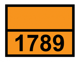
The “UN number” of the substance is the four digit number middle left, and is an international identification number. As far as I know, all chemicals that are transported in bulk have their own UN number, but less common substances may be transported under a generic code, such as UN 2924, which is “Flammable liquid, corrosive, n.o.s.” (where n.o.s. stands for “not otherwise specified”).
The image above is for 1203, which is petrol, and you will see that on the side of petrol tankers on the road, as well as 1202, diesel. At one time 1285 was used for petrol, but I have been unable to find out when that stopped being the case.
There is no pattern to how UN numbers were assigned as far as I know; your best bet is to just look up the substance. If it has a Wiki page, the UN number will be in the data panel on the right; failing that, look for a safety data sheet (about three quarters of the way though you should find the transport information).
Bottom left is obviously the phone number. Bear in mind phone numbers changed around 2000, with many area codes gaining an extra “1”. It also seems to have been common at one time to put the area code in brackets, with the place written above the number, presumably from before standard trunk dialing was universal.
Bottom right is an indicia for the company, and may be a logo.
Top right is the pictogram representing the primary hazard for this substance. In the example, the primary hazard is that it is highly flammable. A full list of pictograms can be found here; click on a symbol to see a larger version that you can paste straight into your InkScape image.
Back in the day, people were not so worried about the environment, so the Hazchem plate does not address the potential environmental impact of an incident. Nowadays, this is a major concern, and substances that will have a big impact will have an additional warning diamond beside the Hazchem plate.
I have been unable to find out when this dates from, but I would guess around 2010 at the earliest?
Appendix 3: Resources
I created or found and edited a few images during the writing of this article. I have collected these into a .zip file that you can download by clicking on the link below. There are SVG images of the most important hazard diamonds and logos for BP and ICI. There is also an SVG file, hazchem_plate.svg, with an example hazchem plate, in both N gauge and OO gauge. It is for methanol from ICI (no guarantee the phone number is correct), but you can easily edit this in InkScape to create your own versions.
Appendix 4: Railway font
British Rail used a specific font with no serif, straight diagonal in the digit 7, straight lines in the top half of the 3, and no decoration on the 1; it looks to be very unusual in that set of features. A good representation of it can be found on-line – I found a free version here.
In windows 10, to install a font, click Start, and go to the Settings. Type in “font” to find Font settings. You should find an area at the top that you can drag the font .otf file into. You will need to restart any programs before the font will be available.
Appendix 5: Varnish
Modellers of various stripe (military, wargames and railway) have for years used Johnson “Klear” floor polish to protect transfers on models.
It looks like it has gone though at least two re-brandings, and I think the product is now called Pledge “Revive It” Floor Gloss. I searched the web sites of Sainsburys, Morrisons, Homebase and B&Q, and none of them stock it, so had to order it from Amazon.
If a member of Preston and District MRS wants some, e-mail me, and I will bring the bottle to the club one Monday, and let you have some (bring a small bottle!).
Appendix 6: Free software
Strange though it may sound, there is actually a lot of good quality software available legally for free on the Internet. In fact there is a good change you are using some to view this page, either Google Chrome or Firefox.
While there are a lot of great people on the Internet happy to give you software for free, there are also unscrupulous people willing to exploit that to get control of your computer, so you do need to be careful. This appendix gives some guidelines on how to do this safely – but nevertheless, anything you download is at your own risk.
Is it good software?
See what other people recommend. Search for reviews on Google, and see what people say on, say, three different review sites. If it does not get decent reviews, do not bother with it.
Use the official site
Go to the official website to download the software. It should have a relatively short web address that includes the company or product name (see below for examples).
Beware the Big Green Button
The organisation will often get revenue from advertising, and that can lead to adverts on the page trying to get you to download the wrong thing. Sometimes the most obvious download button is an advert!
Hover your mouse over the image or link, and the web address of the destination will appear at the bottom left of your browser. If it is a different site, be very careful! It might be legitimate; sometimes they do host elsewhere. Chances are, however, it is an advert trying to fool you.
More here on how to download safely.
Choose a version
You will often get a choice of downloads. Which is right for you? It depends on your operating system. Sometimes it will just say “Windows Installer”, and if you use Windows, it is as simple as that.
Otherwise, if you use Windows, you probably want the 64-bit version (if your PC is more than 5 years old, it just might need 32-bit). If there is an MSI (.msi) option, go for that, otherwise go for .exe.
Chances are there will be a Mac option too (and Linux), and it should be reasonable clear which one to go for.
Generally you want the most recent, stable version.
Some recommendations
A selection of free software I have found and recommend.
LibreOffice (https://www.libreoffice.org/): Word processor and spreadsheet
Google Chrome (https://www.google.com/chrome/): Web browser
GIMP (https://www.gimp.org/): Image editor
InkScape (https://inkscape.org/): Vector-based image editor
Audacity (https://www.audacityteam.org/): Sound editor
Notepad++ (https://notepad-plus-plus.org/): Advanced text editor
Adobe Acrobat Reader (https://get.adobe.com/uk/reader/): PDF document viewer
7-Zip (https://www.7-zip.org/): File compression and decompression (creating and opening .zip files)
Blender (https://www.blender.org/download/): 3d modelling